Behind every great merger, there’s a great merger branding strategy
Project Overview
Bloomreach has acquired Hippo a few years back and there has not been a clear stand on the newly merged brand, but it was a clear that trying to look at the new identity fr the company was the way to go.
“The world of marketing and customer acquisition is quickly moving to machine-learning and data-driven personalized experiences. The combination of Bloomreach’s world-class search and personalization technology with Hippo’s content management solution will allow companies across industries to create the most modern digital customer experiences,” said Ajay Agarwal, managing director of Bain Capital Ventures, a Bloomreach investor.
Impact
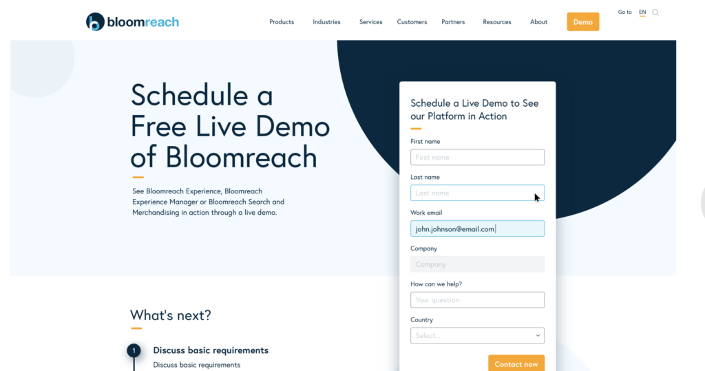
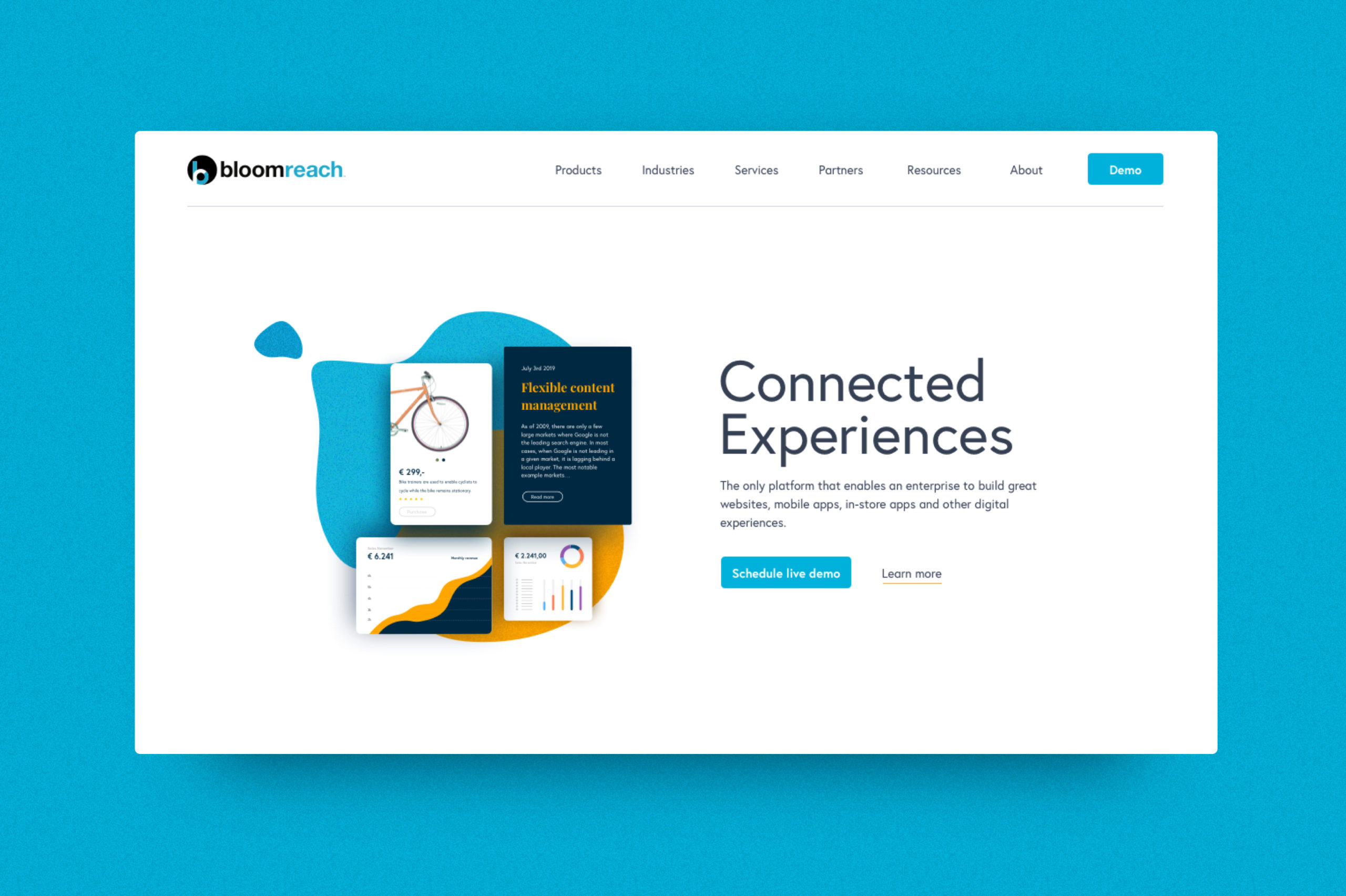
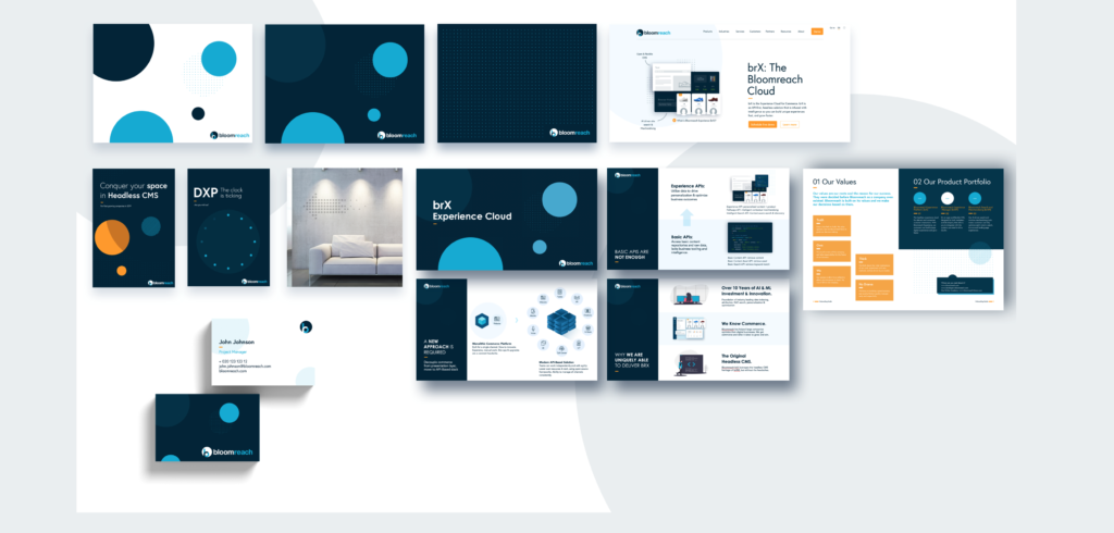
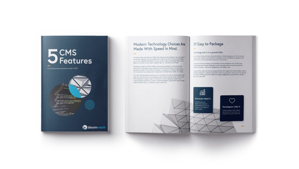
Brand mergers and acquisitions often result in a need for rebranding or an elevation of the brand. We have worked together on blending the two new companies’ mission, vision, values, visual identity into one cohesive strong brand ready for the future.
As an example, in the new colour pallete, we have decided one of main colour will be dark navy for background (as both companies were using it extensively in most brand assets), and main highlight would be in either light blue (representing the main Blomreach colour) or orange (representing the primary Hippo colour).
Responsibilities
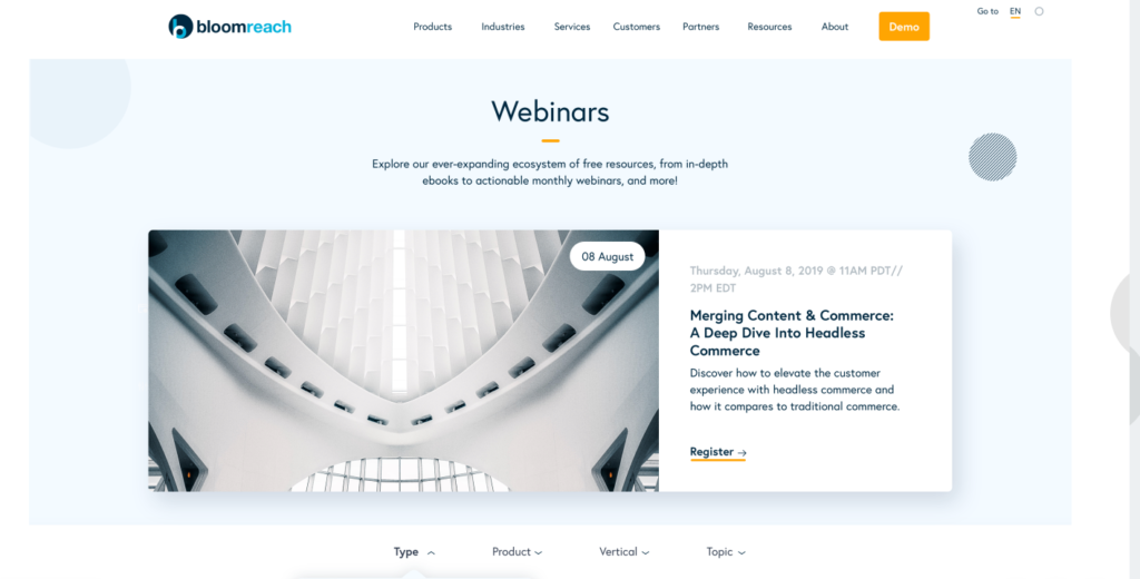
With the newly created core identity, we have started re-vamping channel by channel from website to social media, to online marketing ads, to sales slide decks to employee branding.